What fonts are you currently using on your system? Which do you think is best for the terminal or for your desktop environment?
(updates) Ok I think I’m a fan of Ubuntu nerd fonts right now
Poppins, RobotoMono, Comfortaa and OpenDyslexic
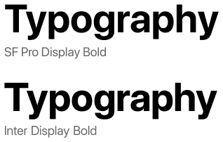
Inter for desktop and the nerd-font variant of JetBrainMono for Terminal.
+1 for Inter. Kind of reminds me of San Francisco :)
🟨 preview: Inter

Lol I re-discovered Inter about 10 minutes ago, I find it a little better than Noto Sans. (edit) I’m not really sure, maybe I’ve gotten too used to the Notos.
I’ve been enjoying Fira Sans and Fira Mono for far too long: https://mozilla.github.io/Fira/
Since basically forever I use DejaVu Sans for UI elements and DejaVu Mono for the terminal.
For terminal/editor I went through CodingFont and ended up on Noto Sans Mono. Before that I used Source Code Pro for years. Both patched for nerd fonts, obviously.
I wish to put in a plug for Noto Sans Semicondensed for spreadsheets, although not generally for system-wide use.
I recommend it for my Tonto2 List Maker script, which uses a spreadsheet layout. Noto Sans Semicondensed has “tabular figures,” which means you can use it in tables to align digits and decimals with simple spaces and still have the look of a proportionally spaced font for text.
Noto Sans Semicondensed is available from Google, of course, but Linux Users will be more likely to install the fonts-noto-core package.
For desktop, I’ve liked Lato, Source Sans Pro, and Inter to name three.
For terminal, I used Iosevka’s customizer to create a gorgeous Fira Mono-like variant that I call Iosevka Firesque:
[buildPlans.IosevkaFiresque] family = "Iosevka Firesque" spacing = "term" serifs = "sans" noCvSs = true exportGlyphNames = false [buildPlans.IosevkaFiresque.variants] inherits = "ss05" [buildPlans.IosevkaFiresque.variants.design] capital-g = "toothless-corner-serifless-hooked" capital-q = "crossing-baseline" g = "single-storey-serifed" long-s = "bent-hook-tailed" cyrl-a = "single-storey-earless-corner-serifed" cyrl-ve = "standard-interrupted-serifless" cyrl-capital-ze = "unilateral-serifed" cyrl-ze = "unilateral-serifed" cyrl-capital-en = "top-left-bottom-right-serifed" cyrl-en = "top-left-bottom-right-serifed" cyrl-capital-er = "open-serifless" cyrl-er = "earless-corner-serifless" cyrl-capital-u = "cursive-flat-hook-serifless" cyrl-u = "curly-motion-serifed" cyrl-capital-e = "unilateral-bottom-serifed" cyrl-e = "unilateral-bottom-serifed" brace = "straight" ampersand = "upper-open" at = "threefold" cent = "open"Gohu Font Nerd is a nice small bitmap font I’m fond of. Only issue is the size for high DPI monitors, but the JetBrainsMono nerd font is a nice vector font that’s easy on the eyes (quite stereotypical/cliché, but that’s for a reason).
Dropping a link for others since it’s the first time I heard of it.
Interesting. What makes you use bitmaps as a system font?
Gohu:

I get it for TTYs. Though for TTYs nothing will take me away from Terminus :]
What makes you use bitmaps as a system font?
I like the aesthetic of bitmaps. Personal preference
U001 is my main system font as a clone of Univers. Monospace is Berkeley Mono—it might be paid/proprietary but boy does it look nice & was an upgrade from several years with Iosevka. JuliaMono is its fallback though since I use Unicode with frequency & Berkeley doesn’t cover all the symbols I use.
The important part is if you care anything about your fonts, you won’t destroy them by patching in that uncurated hodgepodge called “Nerd Fonts” clobbering used symbols or the wrought-with-false-positive “coding ligatures” which is not how ligatures are supposed to be used but programmers refuse to demand Unicode support in their languages to fix the problem.
U001 is new to me, so here’s a link for others to look it up.
The license is Aladdin which is kinda predates GPL but allows free usage if you aren’t shipping the font with your own competing paid software.
I know that this will anger some people, but I just use the defaults and I don’t get why there are so many fonts, since they don’t seem that much different to me.
I like Delugia for any monospace needs. It’s a nerdfont, and it’s nicely readable without looking too chunky.
Ah, looks like it’s a pre-nerdified cascadia! Not my personal style, but I know a few that love cascadia.
Iosevka
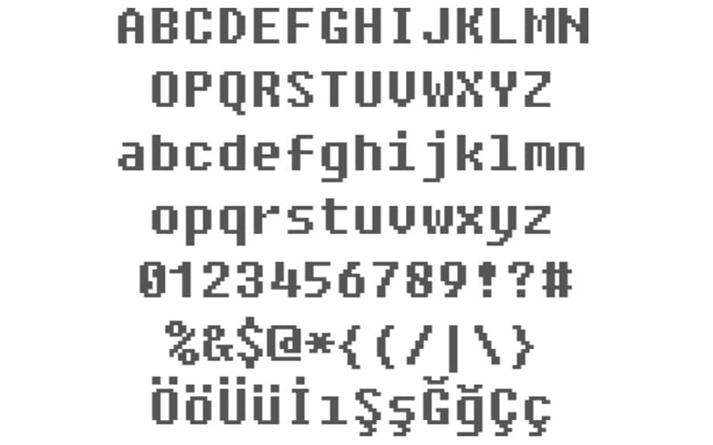
Fixedsys
Ohh, that’s what that 8bit-y font is called.
…wait. Why would you use 8bit as a system font???
🟨 preview: Fixedsys

Hack nerd font is my go to for terminal use.
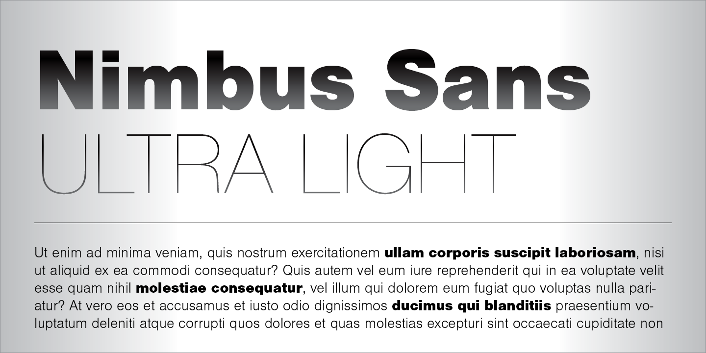
Anyone using Nimbus Sans?

It’s actually preinstalled in a lot of systems. You can check via
gnome-font-viewerorfind /usr/share/fonts -name "*Nimbus*"I find comic sans mono actually looks surprisingly nice for coding and terminal.


